图像滑块
在本课程中,我们将学习如何在 shader 中加载和使用纹理图像来创建这个响应式图像滑块:
这是在移动设备上的最终效果:
该项目灵感来自 Sikriti Dakua 的这个 Codepen。
希望你有学习这个效果的动力,开始吧!
初始项目
我们的初始项目包含一个全屏部分,其中有一个 logo,一个菜单按钮和一个 <Canvas> 组件,中间有一个白色立方体。
我们将使用 Framer Motion 来为 HTML 元素 添加动画,但你也可以使用任何其他库,甚至是普通的 CSS 来为它们添加动画。我们只会使用 Framer Motion 的默认版本,不需安装 3D package。
对于 UI 我选择了 Tailwind CSS,但请随意使用你最习惯的解决方案。
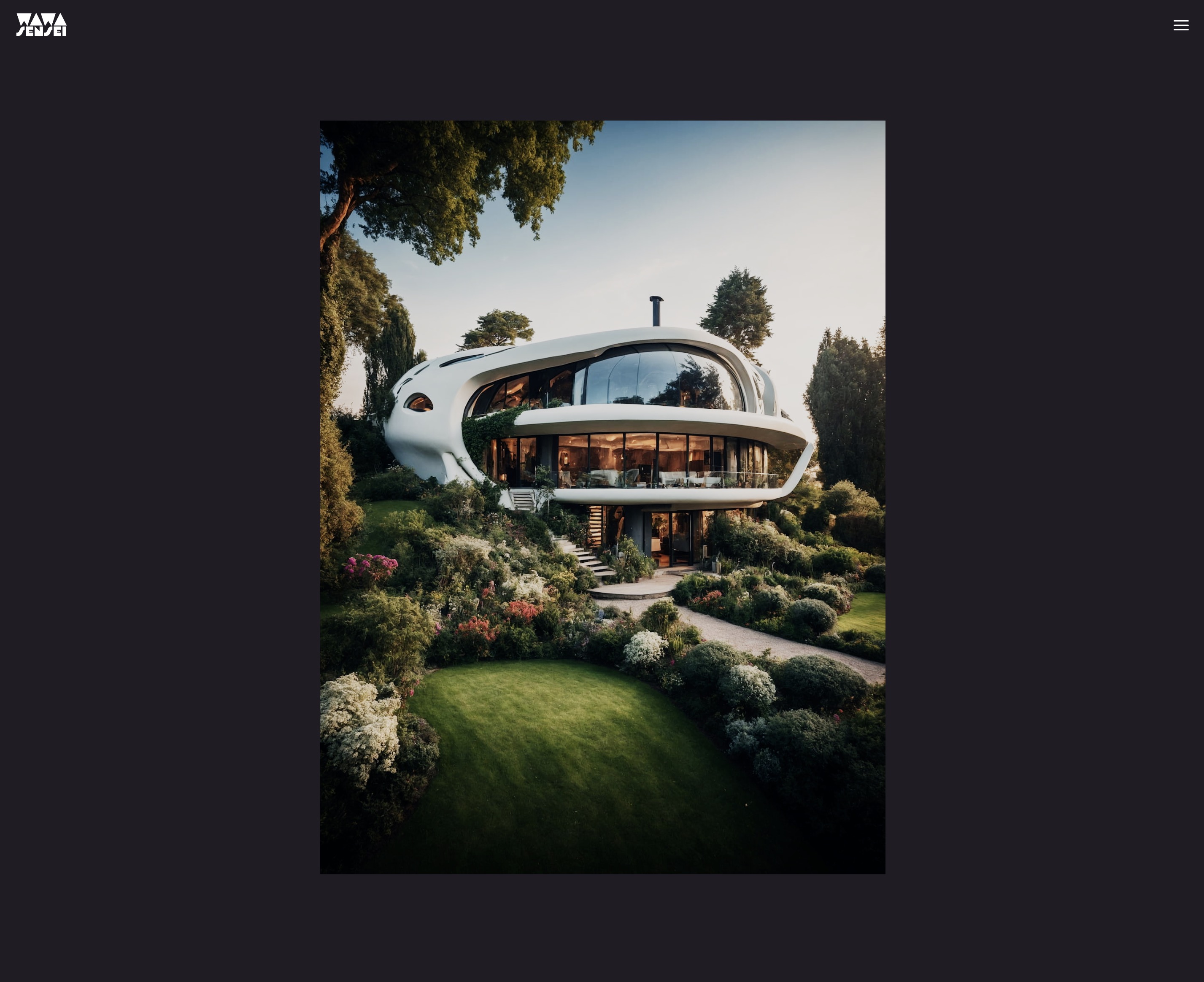
public/textures/optimized 文件夹中包含了我们将在滑块中使用的图片。这些图片是我使用 Leonardo.Ai 生成并用 Squoosh 优化的。我选择了 3:4 的比例,以拥有适合移动设备的纵向方向。
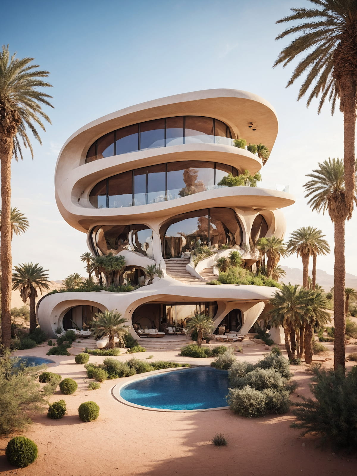
我们将使用的图像之一,用 Squoosh 从 3.9mb 优化到 311kb。
图片滑块组件
让我们开始用一个用来显示图片的平面替换白色立方体。我们创建一个名为 ImageSlider 的新组件:
export const ImageSlider = ({ width = 3, height = 4, fillPercent = 0.75 }) => { return ( <mesh> <planeGeometry args={[width, height]} /> <meshBasicMaterial color="white" /> </mesh> ); };
调整宽度和高度以符合你将使用的图片的长宽比。
fillPercent 属性将用于调整平面的尺寸以占用屏幕高度/宽度的百分比。
在 App.jsx 中,我们导入 ImageSlider 组件并用它替换白色立方体:
import { ImageSlider } from "./ImageSlider"; // ... function App() { return ( <> {/* ... */} <Canvas camera={{ position: [0, 0, 5], fov: 30 }}> <color attach="background" args={["#201d24"]} /> <ImageSlider /> </Canvas> {/* ... */} </> ); } // ...
这是结果:
平面占用了太多空间
我们希望我们的平面是响应式的,并且只占用屏幕高度的 75%(fillPercent)。我们可以通过使用 useThree 钩子来获取 viewport 的尺寸,并创建一个比例因子来调整平面尺寸来实现这一点:
import { useThree } from "@react-three/fiber"; export const ImageSlider = ({ width = 3, height = 4, fillPercent = 0.75 }) => { const viewport = useThree((state) => state.viewport); const ratio = viewport.height / (height / fillPercent); return ( <mesh> <planeGeometry args={[width * ratio, height * ratio]} /> <meshBasicMaterial color="white" /> </mesh> ); };
要计算我们的比例因子,我们将 viewport.height 除以平面的 height 再除以 fillPercent。这将给我们一个可以用来缩放平面的比例。
为了理解背后的数学,我们可以将
viewport.height视为平面的最大高度。如果我们的视口高度是 3 而平面高度是 4,我们需要通过3 / 4缩放平面以使其适应屏幕。 但是因为我们只想占用屏幕高度的 75%,我们将平面高度除以fillPercent以获得新的参考高度。即4 / 0.75 = 5.3333。
然后我们将 width 和 height 乘以 ratio 以获得新尺寸。
它在我们垂直调整大小时工作得很好,但在横向调整时效果不佳。我们需要调整平面的宽度,以便在视口高度大于宽度时只占屏幕宽度的 75%。
import { useThree } from "@react-three/fiber"; export const ImageSlider = ({ width = 3, height = 4, fillPercent = 0.75 }) => { const viewport = useThree((state) => state.viewport); let ratio = viewport.height / (height / fillPercent); if (viewport.width < viewport.height) { ratio = viewport.width / (width / fillPercent); } return ( <mesh> <planeGeometry args={[width * ratio, height * ratio]} /> <meshBasicMaterial color="white" /> </mesh> ); };
不要忘记将 ratio 从 const 更改为 let 以便重新赋值。(或者使用三元运算符代替)
现在平面是响应式的,根据屏幕尺寸,它只占屏幕高度或宽度的 75%。
我们准备在平面上显示图像。
自定义 shader 图像纹理
首先,我们使用 Drei 中的 useTexture 钩子加载一张图像并将其显示在当前的 <meshBasicMaterial> 上:
import { useTexture } from "@react-three/drei"; // ... export const ImageSlider = ({ width = 3, height = 4, fillPercent = 0.75 }) => { const image = "textures/optimized/Default_authentic_futuristic_cottage_with_garden_outside_0.jpg"; const texture = useTexture(image); // ... return ( <mesh> <planeGeometry args={[width * ratio, height * ratio]} /> <meshBasicMaterial color="white" map={texture} /> </mesh> ); };
图像优雅地显示在平面上。
现在,因为我们希望在图像之间切换和悬停时添加创意效果,我们将创建一个自定义 shader 材质,以便能够同时显示两张图像并对其进行动画处理。
ImageSliderMaterial
让我们创建一个名为 ImageSliderMaterial 的自定义 shader 材质。我选择将它保存在与 ImageSlider 组件相同的文件中,因为它与组件紧密相关。但如果你愿意,也可以创建一个单独的文件。
// ... import { shaderMaterial } from "@react-three/drei"; import { extend } from "@react-three/fiber"; const ImageSliderMaterial = shaderMaterial( { uTexture: undefined, }, /*glsl*/ ` varying vec2 vUv; void main() { vUv = uv; gl_Position = projectionMatrix * modelViewMatrix * vec4(position, 1.0); }`, /*glsl*/ ` varying vec2 vUv; uniform sampler2D uTexture; void main() { vec2 uv = vUv; vec4 curTexture = texture2D(uTexture, vUv); gl_FragColor = curTexture; }` ); extend({ ImageSliderMaterial, }); // ...
我们将纹理存储在一个名为 uTexture 的 uniform 中,并将其传递给片段 shader 以显示它。
uTexture 的 uniform 类型是 sampler2D,用于存储 2D 纹理。
为了提取特定位置的纹理颜色,我们使用 texture2D 函数并传入 uTexture 和 vUv 坐标。
让我们用新的 ImageSliderMaterial 替换 meshBasicMaterial:
// ... export const ImageSlider = ({ width = 3, height = 4, fillPercent = 0.75 }) => { // ... return ( <mesh> <planeGeometry args={[width * ratio, height * ratio]} /> <imageSliderMaterial uTexture={texture} /> </mesh> ); };
使用自定义 shader 材质显示图像。
色彩分级
我知道你开始拥有敏锐的眼睛 🦅 并且注意到图像的色彩分级看起来不同了!
这是因为 <meshBasicMaterial/> 在片段着色器内进行了一些额外的处理,以根据渲染器上选择的 tone mapping 和 color space 来调整颜色。
虽然这可以在我们的自定义着色器中手动复制,但这不是本节课程的目标,这是一个高级话题。
相反,我们可以使用现成的片段来实现与标准 Three.js materials 相同的效果。如果查看 meshBasicMaterial 的源代码,你会看到它是 #include 语句和自定义代码的混合。
为了使代码易于重用和维护,Three.js 使用预处理器来从其它文件中包含代码。幸运的是,我们也可以在自定义着色材质中使用这些着色器块!
让我们在片段着色器的末尾添加这两行:
void main() { // ... #include <tonemapping_fragment> #include <encodings_fragment> }
为了更好地理解着色器块如何工作,该工具允许您点击 include 语句来查看所包含的代码:ycw.github.io/three-shaderlib-skim
现今的色彩分级与 meshBasicMaterial 相同。 🎨
在进一步研究着色器之前,让我们准备好我们的 UI。
Zustand 状态管理
Zustand 是一个小型、快速且可扩展的状态管理库,它允许我们创建一个全局存储来管理应用程序状态。
相比 Redux 或自定义上下文解决方案,Zustand 是一种在组件之间共享状态并管理复杂状态逻辑的替代方案。(即使在我们的项目中并不如此,我们的逻辑很简单。)
让我们将 Zustand 添加到我们的项目中:
yarn add zustand
在 hooks 文件夹中创建一个名为 useSlider.js 的新文件:
import { create } from "zustand"; export const useSlider = create((set) => ({}));
create 函数接受一个函数作为参数,该函数将接收一个 set 函数来更新和合并状态。我们可以将我们的状态和方法放入返回的对象中。
首先是我们所需的数据:
// ... export const useSlider = create((set) => ({ curSlide: 0, direction: "start", items: [ { image: "textures/optimized/Default_authentic_futuristic_cottage_with_garden_outside_0.jpg", short: "PH", title: "Relax", description: "享受内心的宁静。", color: "#201d24", }, { image: "textures/optimized/Default_balinese_futuristic_villa_with_garden_outside_jungle_0.jpg", short: "TK", title: "Breath", color: "#263a27", description: "感受自然的环绕。", }, { image: "textures/optimized/Default_desert_arabic_futuristic_villa_with_garden_oasis_outsi_0.jpg", short: "OZ", title: "Travel", color: "#8b6d40", description: "勇敢面对未知。", }, { image: "textures/optimized/Default_scandinavian_ice_futuristic_villa_with_garden_outside_0.jpg", short: "SK", title: "Calm", color: "#72a3ca", description: "释放你的思想。", }, { image: "textures/optimized/Default_traditional_japanese_futuristic_villa_with_garden_outs_0.jpg", short: "AU", title: "Feel", color: "#c67e90", description: "情感与体验。", }, ], }));
curSlide将存储当前幻灯片的索引。direction将存储过渡的方向。items将存储幻灯片的数据。(图片路径,简称,标题,背景色和描述)
现在我们可以创建前往上一张和下一张幻灯片的方法:
// ... export const useSlider = create((set) => ({ // ... nextSlide: () => set((state) => ({ curSlide: (state.curSlide + 1) % state.items.length, direction: "next", })), prevSlide: () => set((state) => ({ curSlide: (state.curSlide - 1 + state.items.length) % state.items.length, direction: "prev", })), }));
set 函数会将新状态与之前的状态合并。我们使用模运算符来在到达最后一张幻灯片时回到第一张,反之亦然。
我们的状态已准备好,接下来让我们准备用户界面。
滑块界面
我们将创建一个名为 Slider 的新组件来显示幻灯片文本详情和导航按钮。在 Slider.jsx 中:
import { useSlider } from "./hooks/useSlider"; export const Slider = () => { const { curSlide, items, nextSlide, prevSlide } = useSlider(); return ( <div className="grid place-content-center h-full select-none overflow-hidden pointer-events-none relative z-10"> {/* 中间容器 */} <div className="h-auto w-screen aspect-square max-h-[75vh] md:w-auto md:h-[75vh] md:aspect-[3/4] relative max-w-[100vw]"> {/* 左上角 */} <div className="w-48 md:w-72 left-4 md:left-0 md:-translate-x-1/2 absolute -top-8 "> <h1 className="relative antialiased overflow-hidden font-display text-[5rem] h-[4rem] leading-[4rem] md:text-[11rem] md:h-[7rem] md:leading-[7rem] font-bold text-white block" > {items[curSlide].short} </h1> </div> {/* 中间箭头 */} <button className="absolute left-4 md:-left-14 top-1/2 -translate-y-1/2 pointer-events-auto" onClick={prevSlide} > <svg xmlns="http://www.w3.org/2000/svg" fill="none" viewBox="0 0 24 24" strokeWidth={1.5} stroke="currentColor" className="w-8 h-8 stroke-white hover:opacity-50 transition-opacity duration-300 ease-in-out" > <path strokeLinecap="round" strokeLinejoin="round" d="M10.5 19.5 3 12m0 0 7.5-7.5M3 12h18" /> </svg> </button> <button className="absolute right-4 md:-right-14 top-1/2 -translate-y-1/2 pointer-events-auto" onClick={nextSlide} > <svg xmlns="http://www.w3.org/2000/svg" fill="none" viewBox="0 0 24 24" strokeWidth={1.5} stroke="currentColor" className="w-8 h-8 stroke-white hover:opacity-50 transition-opacity duration-300 ease-in-out" > <path strokeLinecap="round" strokeLinejoin="round" d="M13.5 4.5 21 12m0 0-7.5 7.5M21 12H3" /> </svg> </button> {/* 右下角 */} <div className="absolute right-4 md:right-auto md:left-full md:-ml-20 bottom-8"> <h2 className="antialiased font-display font-bold text-transparent text-outline-0.5 block overflow-hidden relative w-[50vw] text-5xl h-16 md:text-8xl md:h-28" > {items[curSlide].title} </h2> </div> <div className="absolute right-4 md:right-auto md:left-full md:top-full md:-mt-10 bottom-8 md:bottom-auto"> <p className="text-white w-64 text-sm font-thin italic ml-4 relative"> {items[curSlide].description} </p> </div> </div> </div> ); };
我们不会详细介绍使用的CSS,但让我向你解释一下主要要点:
- 中间容器是一个
div,用于再现我们3D平面的尺寸和长宽比。这样我们可以相对于平面定位文本和按钮。 - 我们使用
aspect-square来保持容器的长宽比。 - 箭头按钮来自于 Heroicons。
- 标题和简称具有固定尺寸,并且隐藏溢出,以便稍后创建有趣的文字效果。
md:类被用来调整大屏幕上的布局。
让我们在 App.jsx 中将我们的 Slider 组件添加到 Canvas 旁边:
// ... import { Slider } from "./Slider"; function App() { return ( <> <main className="bg-black"> <section className="w-full h-screen relative"> {/* ... */} <Slider /> <Canvas camera={{ position: [0, 0, 5], fov: 30 }}> <color attach="background" args={["#201d24"]} /> <ImageSlider /> </Canvas> </section> {/* ... */} </main> </> ); } export default App;
滑块显示在canvas之前。
我们需要更改 Canvas 的样式,使其显示为背景并占据全屏宽度和高度:
{/* ... */} <Canvas camera={{ position: [0, 0, 5], fov: 30 }} className="top-0 left-0" style={{ // 覆盖 R3F 应用的默认样式 width: "100%", height: "100%", position: "absolute", }} > {/* ... */}
让我们在 index.css 中添加自定义字体和样式:
@import url("https://fonts.googleapis.com/css2?family=Red+Rose:wght@700&display=swap&family=Poppins:ital,wght@1,100&display=swap"); @tailwind base; @tailwind components; @tailwind utilities; @layer base { .text-outline-px { -webkit-text-stroke: 1px white; } .text-outline-0\.5 { -webkit-text-stroke: 2px white; } .text-outline-1 { -webkit-text-stroke: 4px white; } }
text-outline 类用于在文本周围创建轮廓。
要添加自定义字体,我们需要更新我们的 tailwind.config.js:
/** @type {import('tailwindcss').Config} */ export default { content: ["./index.html", "./src/**/*.{js,ts,jsx,tsx}"], theme: { extend: {}, fontFamily: { sans: ["Poppins", "sans-serif"], display: ["Red Rose", "sans-serif"], }, }, plugins: [], };
现在我们有了一个漂亮的UI:
文本效果
为了使过渡更有趣,我们将为标题、缩写和描述添加一些文本效果。
首先,我们需要获取方向,以了解是前往下一个还是上一个幻灯片。我们可以从 useSlider hook 中获取它:
// ... export const Slider = () => { const { curSlide, items, nextSlide, prevSlide, direction } = useSlider(); // ... };
为了能够将先前显示的文本移出并将新文本移入,我们需要前一个幻灯片的索引。我们可以很容易地计算出来:
// ... export const Slider = () => { // ... let prevIdx = direction === "next" ? curSlide - 1 : curSlide + 1; if (prevIdx === items.length) { prevIdx = 0; } else if (prevIdx === -1) { prevIdx = items.length - 1; } // ... };
现在,我们可以借助 Framer Motion 添加文本效果。让我们从右下角的标题开始:
// ... import { motion } from "framer-motion"; const TEXT_TRANSITION_HEIGHT = 150; export const Slider = () => { // ... return ( <div className="grid place-content-center h-full select-none overflow-hidden pointer-events-none relative z-10"> {/* MIDDLE CONTAINER */} <div className="h-auto w-screen aspect-square max-h-[75vh] md:w-auto md:h-[75vh] md:aspect-[3/4] relative max-w-[100vw]"> {/* ... */} {/* BOTTOM RIGHT */} <div className="absolute right-4 md:right-auto md:left-full md:-ml-20 bottom-8"> <h2 className="antialiased font-display font-bold text-transparent text-outline-0.5 block overflow-hidden relative w-[50vw] text-5xl h-16 md:text-8xl md:h-28" > {items.map((item, idx) => ( <motion.div key={idx} className="absolute top-0 left-0 w-full text-right md:text-left" animate={ idx === curSlide ? "current" : idx === prevIdx ? "prev" : "next" } variants={{ current: { transition: { delay: 0.4, staggerChildren: 0.06, }, }, }} > {item.title.split("").map((char, idx) => ( <motion.span key={idx} className="inline-block" // to make the transform work (translateY) variants={{ current: { translateY: 0, transition: { duration: 0.8, from: direction === "prev" ? -TEXT_TRANSITION_HEIGHT : TEXT_TRANSITION_HEIGHT, type: "spring", bounce: 0.2, }, }, prev: { translateY: direction === "prev" ? TEXT_TRANSITION_HEIGHT : -TEXT_TRANSITION_HEIGHT, transition: { duration: 0.8, from: direction === "start" ? -TEXT_TRANSITION_HEIGHT : 0, }, }, next: { translateY: TEXT_TRANSITION_HEIGHT, transition: { from: TEXT_TRANSITION_HEIGHT, }, }, }} > {char} </motion.span> ))} </motion.div> ))} </h2> </div> {/* ... */} </div> </div> ); };
我们使用 animate 属性在不同状态之间切换,并在 variants 属性中定义每个状态的不同属性。
为了动画化每个字符,我们将标题拆分为字符数组,并使用 staggerChildren 属性来延迟每个字符的动画。
from 属性用于定义动画的起始位置。
让我们去掉标题的 overflow-hidden 以查看效果:
标题文字进出动画。
让我们把相同的效果添加到缩写上:
// ... export const Slider = () => { // ... return ( <div className="grid place-content-center h-full select-none overflow-hidden pointer-events-none relative z-10"> {/* MIDDLE CONTAINER */} <div className="h-auto w-screen aspect-square max-h-[75vh] md:w-auto md:h-[75vh] md:aspect-[3/4] relative max-w-[100vw]"> {/* TOP LEFT */} <div className="w-48 md:w-72 left-4 md:left-0 md:-translate-x-1/2 absolute -top-8 "> <h1 className="relative antialiased overflow-hidden font-display text-[5rem] h-[4rem] leading-[4rem] md:text-[11rem] md:h-[7rem] md:leading-[7rem] font-bold text-white block" > {items.map((_item, idx) => ( <motion.span key={idx} className="absolute top-0 left-0 md:text-center w-full" animate={ idx === curSlide ? "current" : idx === prevIdx ? "prev" : "next" } variants={{ current: { translateY: 0, transition: { duration: 0.8, from: direction === "prev" ? -TEXT_TRANSITION_HEIGHT : TEXT_TRANSITION_HEIGHT, type: "spring", bounce: 0.2, delay: 0.4, }, }, prev: { translateY: direction === "prev" ? TEXT_TRANSITION_HEIGHT : -TEXT_TRANSITION_HEIGHT, transition: { type: "spring", bounce: 0.2, delay: 0.2, from: direction === "start" ? -TEXT_TRANSITION_HEIGHT : 0, }, }, next: { translateY: TEXT_TRANSITION_HEIGHT, transition: { from: TEXT_TRANSITION_HEIGHT, }, }, }} > {items[idx].short} </motion.span> ))} </h1> </div> {/* ... */} </div> </div> ); };
以及描述的简单淡入淡出效果:
// ... export const Slider = () => { // ... return ( <div className="grid place-content-center h-full select-none overflow-hidden pointer-events-none relative z-10"> {/* MIDDLE CONTAINER */} <div className="h-auto w-screen aspect-square max-h-[75vh] md:w-auto md:h-[75vh] md:aspect-[3/4] relative max-w-[100vw]"> {/* ... */} {/* BOTTOM RIGHT */} {/* ... */} <div className="absolute right-4 md:right-auto md:left-full md:top-full md:-mt-10 bottom-8 md:bottom-auto"> <p className="text-white w-64 text-sm font-thin italic ml-4 relative"> {items.map((item, idx) => ( <motion.span key={idx} className="absolute top-0 left-0 w-full text-right md:text-left" animate={ idx === curSlide ? "current" : idx === prevIdx ? "prev" : "next" } initial={{ opacity: 0, }} variants={{ current: { opacity: 1, transition: { duration: 1.2, delay: 0.6, from: 0, }, }, }} > {item.description} </motion.span> ))} </p> </div> </div> </div> ); };
我们的UI现在已动画化并准备好使用。
我们准备好进入本课中最有趣的部分:着色器过渡效果! 🎉
图像过渡效果
就像我们为文本动画所做的那样,要在图像之间进行过渡,我们需要当前和先前的图像纹理。
让我们在 ImageSlider 组件中存储之前的图像路径:
// ... import { useSlider } from "./hooks/useSlider"; import { useEffect, useState } from "react"; export const ImageSlider = ({ width = 3, height = 4, fillPercent = 0.75 }) => { const { items, curSlide } = useSlider(); const image = items[curSlide].image; const texture = useTexture(image); const [lastImage, setLastImage] = useState(image); const prevTexture = useTexture(lastImage); useEffect(() => { const newImage = image; return () => { setLastImage(newImage); }; }, [image]); // ... };
通过使用 useEffect hook,我们将当前图像路径存储在 lastImage 状态中,当图像更改时,我们用新图像路径更新 lastImage 状态。
在使用我们的着色器中的 prevTexture 之前,以及在我们忘记之前,让我们预加载所有图像,以避免在更改幻灯片时闪烁:
// ... export const ImageSlider = ({ width = 3, height = 4, fillPercent = 0.75 }) => { // ... }; useSlider.getState().items.forEach((item) => { useTexture.preload(item.image); });
通过这样做,我们预加载了所有图像,我们可以在网站开始时安全地添加加载屏幕以避免任何闪烁。
现在,让我们在 ImageSliderMaterial 中添加两个 uniform 变量来存储之前的纹理和过渡的进度:
// ... const ImageSliderMaterial = shaderMaterial( { uProgression: 1.0, uTexture: undefined, uPrevTexture: undefined, }, /*glsl*/ ` // ... `, /*glsl*/ ` varying vec2 vUv; uniform sampler2D uTexture; uniform sampler2D uPrevTexture; uniform float uProgression; void main() { vec2 uv = vUv; vec4 curTexture = texture2D(uTexture, vUv); vec4 prevTexture = texture2D(uPrevTexture, vUv); vec4 finalTexture = mix(prevTexture, curTexture, uProgression); gl_FragColor = finalTexture; #include <tonemapping_fragment> #include <encodings_fragment> }` ); // ... export const ImageSlider = ({ width = 3, height = 4, fillPercent = 0.75 }) => { // ... return ( <mesh> <planeGeometry args={[width * ratio, height * ratio]} /> <imageSliderMaterial uTexture={texture} uPrevTexture={prevTexture} uProgression={0.5} /> </mesh> ); };
我们使用 mix 函数基于 uProgression uniform 在之前和当前纹理之间进行插值。
我们可以看到先前和当前图像之间的混合效果。
淡入淡出效果
让我们通过动画化 uProgression uniform 来创建图像间的平滑过渡。
首先,我们需要一个对 material 的引用,以便更新 uProgression uniform:
// ... import { useRef } from "react"; export const ImageSlider = ({ width = 3, height = 4, fillPercent = 0.75 }) => { // ... const material = useRef(); // ... return ( <mesh> <planeGeometry args={[width * ratio, height * ratio]} /> <imageSliderMaterial ref={material} uTexture={texture} uPrevTexture={prevTexture} /> </mesh> ); };
我们可以去掉 uProgression 属性,因为我们会手动更新。
现在,在图像变化的 useEffect 中,我们可以将 uProgression 设置为 0,并在 useFrame 循环中将其动画化到 1:
// ... import { useFrame } from "@react-three/fiber"; import { MathUtils } from "three/src/math/MathUtils.js"; export const ImageSlider = ({ width = 3, height = 4, fillPercent = 0.75 }) => { // ... useEffect(() => { const newImage = image; material.current.uProgression = 0; return () => { setLastImage(newImage); }; }, [image]); useFrame(() => { material.current.uProgression = MathUtils.lerp( material.current.uProgression, 1, 0.05 ); }); // ... };
现在,我们已经实现了图像间的平滑过渡。
让我们在此基础上创建一个更有趣的效果。
扭曲位置
为了使过渡更有趣,我们将图像推向过渡的方向。
我们将使用 vUv 坐标来扭曲图像的位置。让我们在 ImageSliderMaterial 中添加一个 uDistortion uniform,并用它来扭曲 vUv 坐标:
React Three Fiber: The Ultimate Guide to 3D Web Development
✨ You have reached the end of the preview ✨
Go to the next level with Three.js and React Three Fiber!
Get full access to this lesson and the complete course when you enroll:
- 🔓 Full lesson videos with no limits
- 💻 Access to the final source code
- 🎓 Course progress tracking & completion
- 💬 Invite to our private Discord community
One-time payment. Lifetime updates included.