Text
In this chapter, we will learn how to add 2D and 3D text to React Three Fiber experiences.
We will see how to use custom fonts, avoid common pitfalls, and some useful techniques to create nice effects.
This lesson is about adding text directly into the scene through the HTML Canvas like other 3D objects. By doing it, it is perfectly integrated into the 3D world by being affected by the light, shadows, and the camera.
BUT the written text is not selectable, not accessible, and not indexed by search engines. It is something to keep in mind to choose the correct way to display text when creating your projects.
Consider using HTML texts when necessary.
2D Text
The simplest way to add text to a React Three Fiber scene is to display 2D text. To do so, we will use the Text component from the drei library.
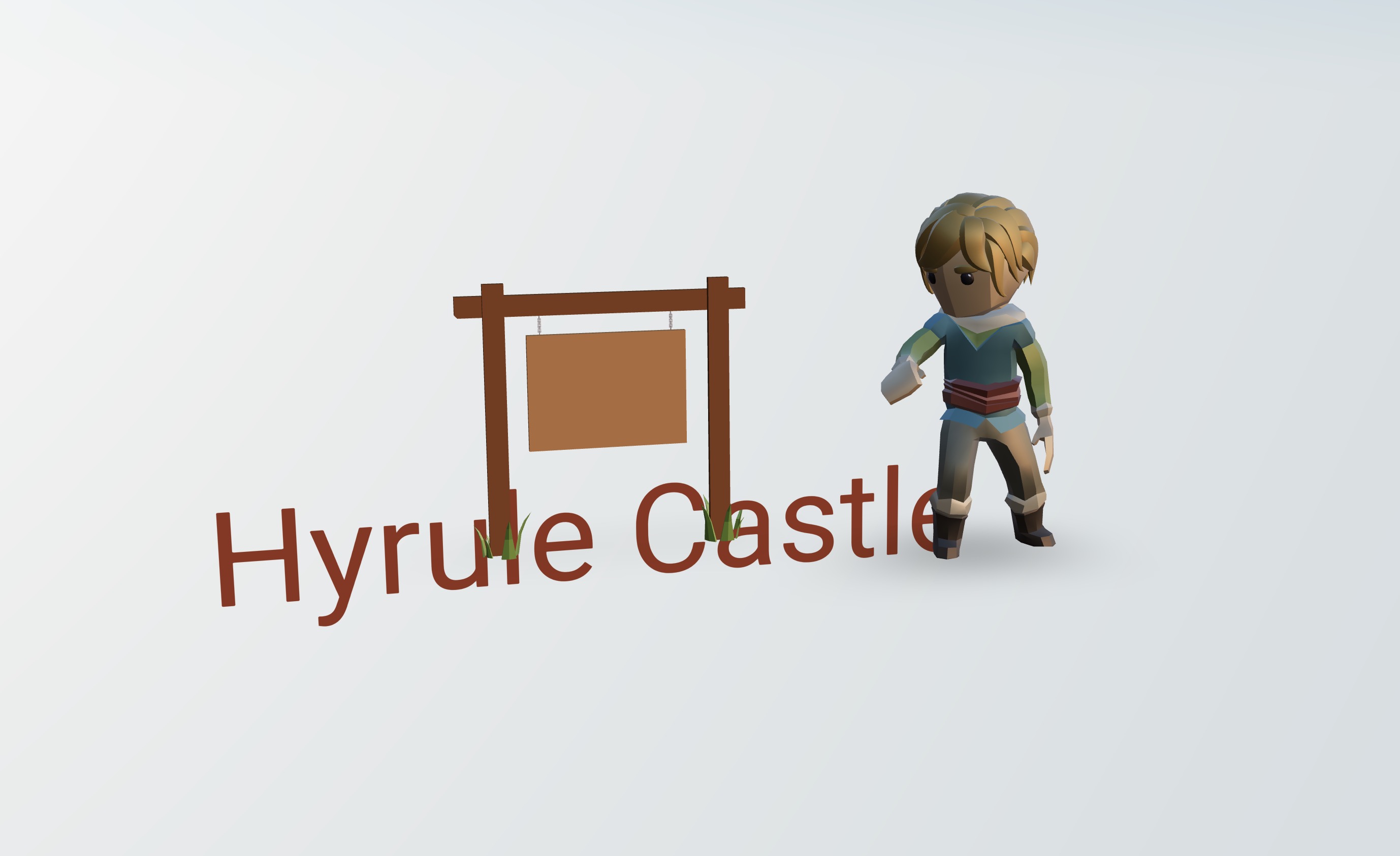
We will add "Hyrule Castle" text to the wooden sign:
import { Text } from "drei"; // ... export const Experience = () => { const woodenSign = useGLTF("models/Wooden Sign.glb"); return ( <> <group position-x={-1.5} rotation-y={THREE.MathUtils.degToRad(15)}> <primitive object={woodenSign.scene} /> <Text> Hyrule Castle <meshStandardMaterial color={"#803d1c"} /> </Text> </group> {/* ... */} </> ); };
In the group containing the wooden sign, we add a Text component with the text we want to display as a child. We also add a meshStandardMaterial with a brown color to make it look like wood.
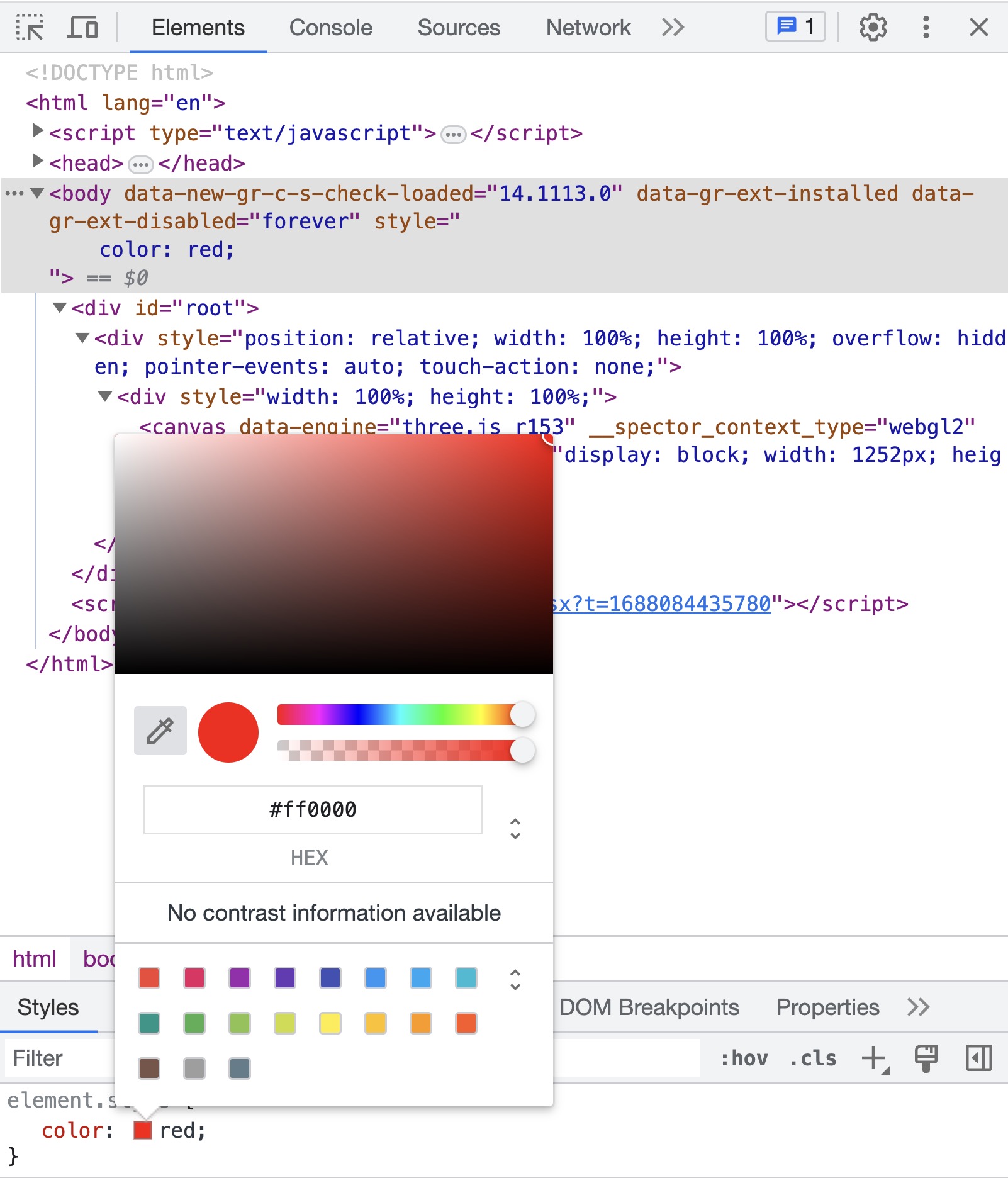
One technique I like to use to find colors is to use the Chrome inspector picker. I add a color: red; to the <body> tag, and then I can use the picker to find the color I want.

Then I can hover the color I want from the scene and copy the hexadecimal value.
Yes there are also tools to do that, but I like the simplicity of using the Developer Tools.
So far the text is too big and not correctly positioned.

To fix this, we can use the fontSize and position props:
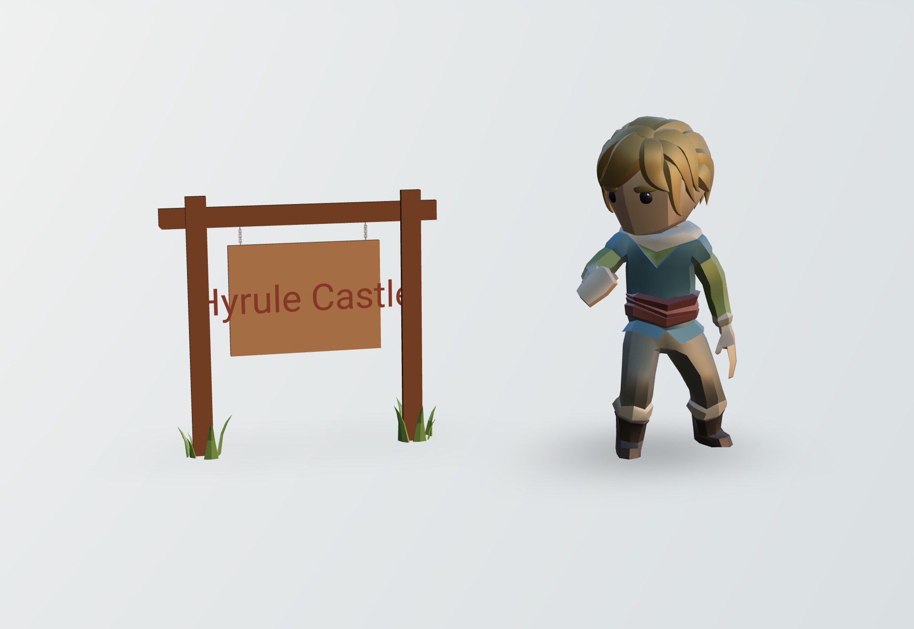
<Text fontSize={0.3} position={[0, 1.2, 0.01]}>

This is better. While the size is correct, it overflows the sign. What would be nice is to have the text centered and wrapped (going to the next line when it reaches the end of the sign).
We can fix this by using the maxWidth and textAlign props:
React Three Fiber: The Ultimate Guide to 3D Web Development
✨ You have reached the end of the preview ✨
Go to the next level with Three.js and React Three Fiber!
Get full access to this lesson and the complete course when you enroll:
- 🔓 Full lesson videos with no limits
- 💻 Access to the final source code
- 🎓 Course progress tracking & completion
- 💬 Invite to our private Discord community
One-time payment. Lifetime updates included.