UI Customization
You can customize the user interface of your AI chatbot to match your brand and provide an optimal user experience.
Ready to Use Components
The kit includes several pre-built UI components made with React and Tailwind CSS.
The UI components are responsible for:
- Rendering (Chat messages, input box, buttons, status indicators)
- User interactions (Sending messages, voice input, toggles)
- Visual feedback (Loading states, typing indicators, audio controls)
It relies on the AI Engine for state management and data flow, allowing you to focus on customizing the look and feel.
Each scenario has its own set of UI components tailored to the specific use case. Components with the same name across scenarios have similar functionality but different styling and behavior.
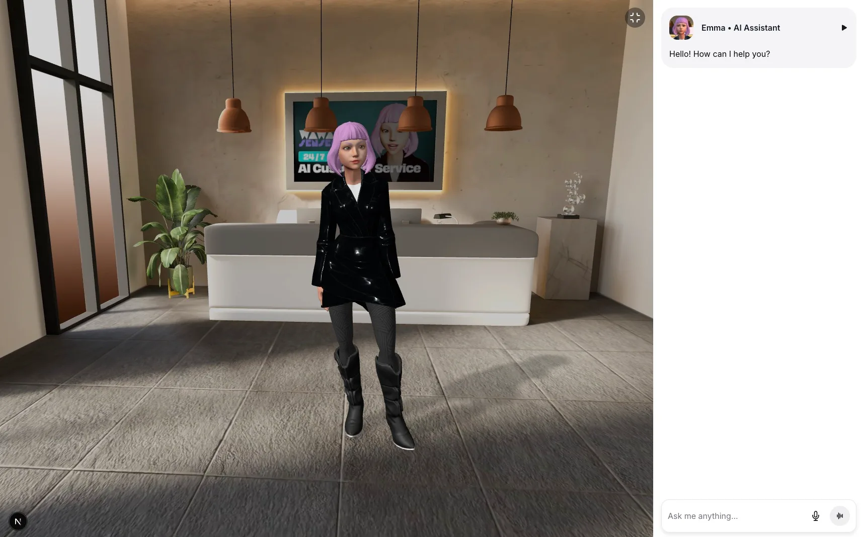
Screenshot of the Customer Service UI in fullscreen mode
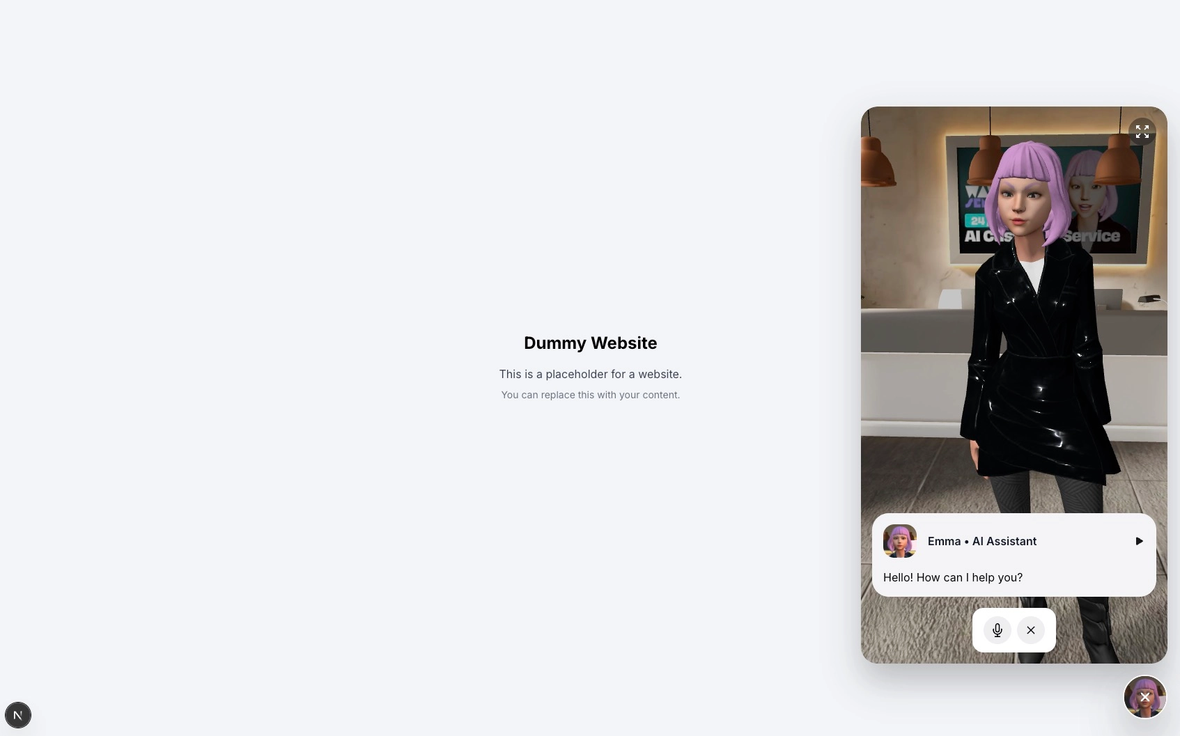
Screenshot of the Customer Service UI in collapsed chat bubble mode
Customer Service Components
Located in /components/customer-service/ui/
ChatInput
Features:
- Text input with contentEditable
- Voice input integration with speech recognition
- Mode switching (chat/voice)
- Send button with loading states
ChatMessage
Features:
- Message bubbles with user/assistant distinction
- Audio playback controls
- Profile images from SceneConfig
- Loading and error states
MicButton & ContinuousMicButton
Features:
- Voice recording controls
- Visual feedback for recording states
- Speech recognition integration
- Tooltip support with Tippy.js
ChatConversation
Features:
- Scrollable message container
- Auto-scroll to latest message
- Message list rendering
- Typing indicator integration
ExpandableChatBubble
Features:
- Collapsible chat interface
- Smooth expand/collapse animations
- Floating bubble design
- Integration with 3D experience
LoadingOverlay
Features:
- Full-screen loading state
- Custom loading animations
- Backdrop blur effect
ChatTyping
Features:
- Animated typing indicator
- Multiple animation variants
- Customizable timing
Wellness Center Components
Located in /components/wellness-center/ui/
StartScreen
Features:
- Welcome overlay for wellness sessions
- Session initialization button
- Branded messaging and styling
ChatInterface
Features:
- Full-screen chat layout optimized for wellness conversations
- Different color scheme focused on calming colors
- Integration with wellness-specific hooks
Other Wellness Components
- ChatInput: Similar functionality to customer service but with wellness-focused styling
- ChatMessage: Adapted messaging design for therapeutic conversations
- ChatConversation: Wellness-optimized conversation flow
- MicButton: Voice input styled for wellness context
- LoadingOverlay: Loading states with wellness branding
- ChatTyping: Typing indicators with appropriate timing
Customization Strategies
1. Component-Level Customization
Override existing components by creating new versions in your scenario folder:
// /components/your-scenario/ui/ChatMessage.jsx import { aiEngine } from "@/store/aiEngine"; export const ChatMessage = ({ message }) => { return ( <div className="your-custom-message-styles"> {/* Your custom message layout */} </div> ); };
2. Styling Customization
Modify Tailwind classes directly in components:
// Before <button className="bg-blue-500 text-white"> {/* After - Custom brand colors */} <button className="bg-purple-600 text-white">
3. Scenario Configuration
Customize UI settings in your SceneConfig:
// SceneConfig.js export const SceneConfig = { scenario: "your-scenario", uiSettings: { assistantName: "Your AI Assistant", assistantImage: "/images/your-scenario/profile.jpg", loadingScreenImage: "/images/your-scenario/loading.webp", }, // ... other settings };
4. Creating New Components
Follow the existing patterns when creating new components:
// /components/your-scenario/ui/YourCustomComponent.jsx import { aiEngine } from "@/store/aiEngine"; export const YourCustomComponent = () => { // Access AI Engine state const someState = aiEngine((state) => state.someProperty); return ( <div className="your-component-styles">{/* Your component JSX */}</div> ); };
State Integration
All UI components integrate with the AI Engine for state management:
import { aiEngine } from "@/store/aiEngine"; export const YourComponent = () => { // Read state const messages = aiEngine((state) => state.conversation); const isLoading = aiEngine((state) => state.loading); // Call actions const sendMessage = aiEngine((state) => state.sendMessage); const setMode = aiEngine((state) => state.setMode); return <div>{/* Use state and actions in your component */}</div>; };
Common Customization Patterns
1. Custom Animations
// Using Framer Motion for custom animations import { motion } from "motion/react"; <motion.div initial={{ opacity: 0, y: 20 }} animate={{ opacity: 1, y: 0 }} transition={{ duration: 0.3 }} > Your animated content </motion.div>;
2. Responsive Design
// Mobile-first responsive design <div className=" flex flex-col gap-2 // Mobile: column layout md:flex-row md:gap-4 // Desktop: row layout p-4 md:p-6 // Responsive padding ">
3. Dark/Light Theme Support
// Theme-aware components <div className=" bg-white dark:bg-gray-900 text-gray-900 dark:text-gray-100 border-gray-200 dark:border-gray-700 ">
4. Icons and Assets
The components use React Icons for consistent iconography:
import { IoArrowUpSharp } from "react-icons/io5"; import { CgSpinner } from "react-icons/cg"; import { PiWaveformBold } from "react-icons/pi"; // Usage in components <IoArrowUpSharp className="w-4 h-4" />;
5. Component Composition
Build complex UIs by composing smaller components:
export const ComplexChatInterface = () => { return ( <div className="flex flex-col h-full"> <ChatHeader /> <ChatConversation /> <ChatInput /> </div> ); };
6. State Management
Keep UI state separate from business logic:
// UI state (local) const [isExpanded, setIsExpanded] = useState(false); // Business state (AI Engine) const messages = aiEngine((state) => state.conversation);
Testing Your Customizations
- Test across scenarios: Ensure your changes work in different contexts
- Responsive testing: Check mobile, tablet, and desktop layouts
- Accessibility: Test with screen readers and keyboard navigation
- Performance: Monitor rendering performance with many messages
- Browser compatibility: Test in different browsers
The UI system is designed to be flexible and maintainable, allowing you to create unique experiences while leveraging the robust foundation provided by Chatbot Kit.